What is Multiple Hypothesis Testing? Multiple hypothesis testing problem refers to an increase in type I error when you perform multiple statistical tests simultaneously.
The type I error (also known as false positive) occurs when the null hypothesis (H0) is actually true but is rejected.
Hypothesis test error table
A multiple hypothesis testing problem occurs when we have to conduct many hypothesis tests at the same time. In genomics experiments, we often perform thousands of hypothesis tests simultaneously to study differences in gene expression between samples.
Sometimes you need to create a Pandas DataFrame with random data for data analysis and exploration.
This article describes three methods of how to create Pandas DataFrame with random data
Method 1 The following example demonstrate how to create a Pandas DataFrame with customized values for each column.
# load packages import pandas as pd import numpy as np # set random seed for reproducibility np.random.seed(42) # crate random pandas dataframe df = pd.
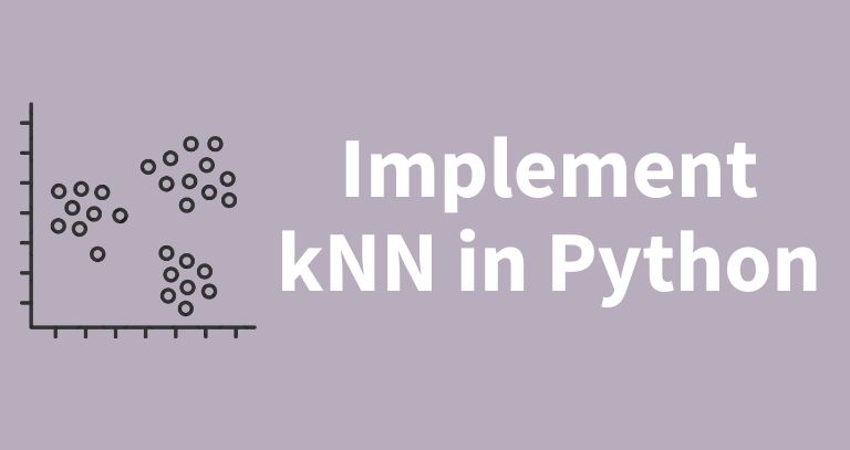
1 kNN background k-Nearest Neighbors (kNN) is a supervised machine learning algorithm widely used for classification and regression analysis.
The kNN algorithm uses the rule of majority for classification and the average of nearest neighbors’ values for regression.
The variable parameter (k), also known as nearest neighbours is a crucial parameter in kNN. An appropriate value of k is crucial; a small value may be sensitive to noise, whereas a large value may smooth out patterns.
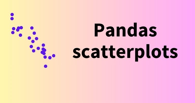
A scatterplot is useful for plotting the relationship between the two continuous variables as data points on a two-dimensional graph.
Scatterplots are useful for identifying patterns, clusters, and trends among variables.
In Pandas, you can create a scatterplot from a DataFrame using the DataFrame.plot.scatter function.
The basic syntax for DataFrame.plot.scatter for creating a scatterplot:
# load package import pandas as pd # create scatterplot df.plot.scatter(x='col1', y='col2', c='red', s=2) Where,
parameter description x The column name for x-axis y The column name for y-axis c Color s data point size The following examples illustrate how to create beautiful scatterplots using Pandas.
A pair plot (scatterplot matrix) is useful for the visualization of pairwise relationships among a set of variables in the dataset.
A pair plot shows the relationships between each variable and all other variables using scatterplots, histograms, and boxplots.
In R, the GGally package, which is an extension to the ggplot2, provides a ggpairs() function to create the pair plots.
ggpairs() automatically detects the type of variable (continuous or categorical) and visualizes the appropriate plot.
In R, there are different ways to represent numerical and integer values.
The numerical values can be represented as both integers and decimals (both 1 and 1.0 are the same).
But in some cases, you need to explicitly create an integer value i.e. the value without any decimal places. For example, during programming, you may have to explicitly create an integer data type.
In R, you can create the integre value using the as.


