Create Pretty Pair Plots with ggplot2
A pair plot (scatterplot matrix) is useful for the visualization of pairwise relationships among a set of variables in the dataset.
A pair plot shows the relationships between each variable and all other variables using scatterplots, histograms, and boxplots.
In R, the GGally package, which is an extension to the ggplot2, provides a ggpairs()
function to create the pair plots.
ggpairs() automatically detects the type of variable (continuous or categorical) and visualizes the appropriate plot.
For example, it generates a scatterplot for continuous variables and a boxplot or histogram for categorical variables.
In this article, we will learn how to use the ggpairs() function to create the beautiful pair plots.
1 Default pair plot
We will use the iris dataset for creating the pair plot.
# load the iris dataset
data(iris)

# view first few rows
head(iris, 2)

  Sepal.Length Sepal.Width Petal.Length Petal.Width Species
1          5.1         3.5          1.4         0.2  setosa
2          4.9         3.0          1.4         0.2  setosa
The iris dataset has four continuous (Sepal.Length, Sepal.Width, Petal.Length, and Petal.Width) and one categorical
variable (Species).
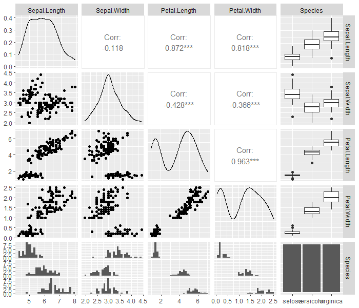
Create a default pair plot using the ggpairs() function,
# load package
# install.packages("GGally")
library(GGally)

# create pair plot
ggpairs(iris)
The pair plot from ggpairs() generates density plots, scatterplots, and correlation values between continuous variables,
and generates a boxplot for categorical variables.
The pair plot also visualizes the histogram (see at the bottom) to understand the distribution of the continuous variable for each group of categorical variables.
2 Colored pair plot
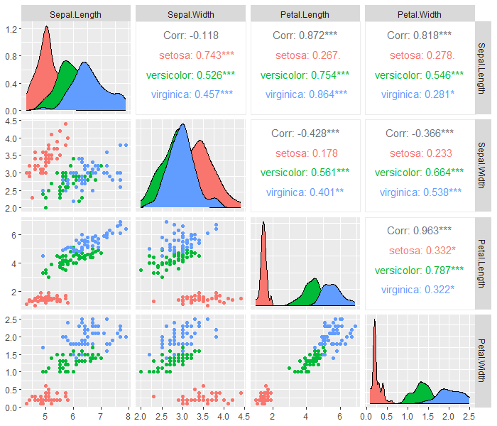
You can use groups in the categorical variable to color the data points from the continuous variables.
We will plot the pair plot among the first four (Sepal.Length, Sepal.Width, Petal.Length, and Petal.Width) variables and color them by categorical variable (Species).
# load package
# install.packages("GGally")
library(GGally)

# load the iris dataset
data(iris)

# create colored pair plot
ggpairs(iris, columns = 1:4, aes(colour = Species))
3 Pair plot on specific columns
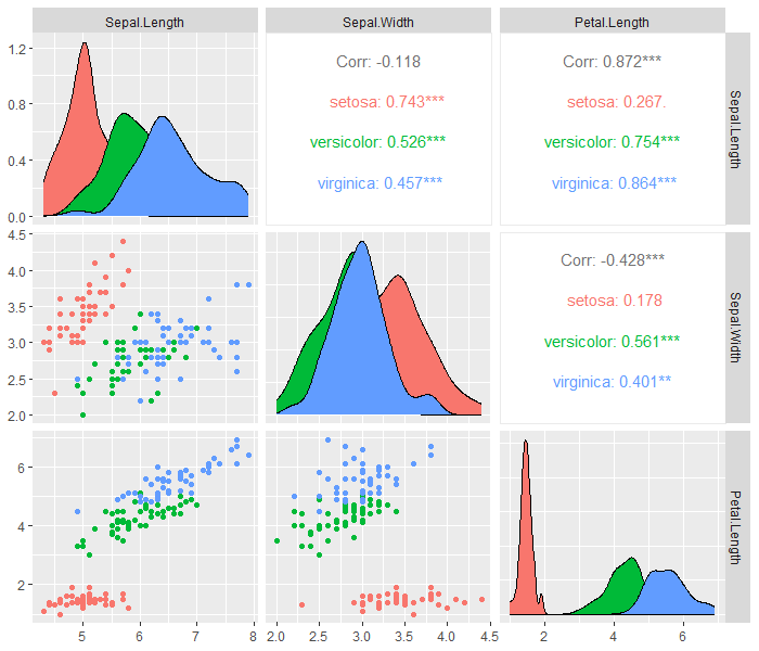
You can also select specific columns in the dataset to create a pair plot among them.
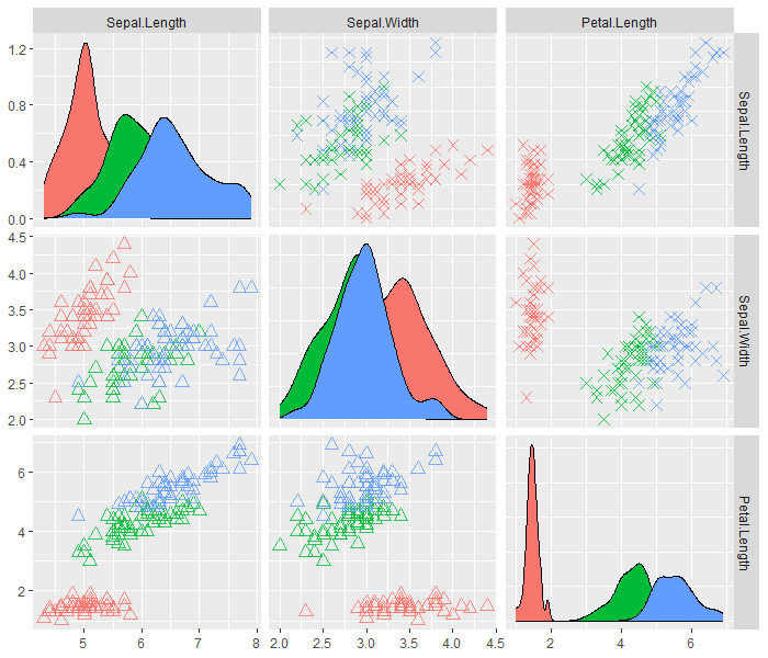
For example, select the first 3 variables from the iris dataset and create a pair plot as follows:
# load package
# install.packages("GGally")
library(GGally)

# load the iris dataset
data(iris)

# create colored pair plot on first 3 variables
ggpairs(iris, columns = 1:3, aes(colour = Species))
4 Change the font size and shape
You can use shape and size parameters to change the shapes and sizes of points in scatterplots.
In ggpairs(), you need to explicitly pass upper and lower parameters to change the aesthetics of upper and lower
scatterplots.
# load package
# install.packages("GGally")
library(GGally)

# load the iris dataset
data(iris)

# create customized pair plot
ggpairs(iris,
       columns = 1:3,
       aes(colour = Species),
       upper = list(continuous = wrap("points", alpha = 0.8, shape = 4, size = 3 )), # change font size and shape of upper panel
       lower = list(continuous = wrap("points", alpha = 0.8, shape = 2, size = 3 )) # change font size and shape of lower panel
)
