Plotting and Shading Confidence Interval in Python
A confidence interval provides an estimated range of values which is likely to include the unknown parameter (such as mean) of a population when you draw samples many times from the population.
For example, if we take 100 random samples, and calculate the 95% confidence interval on each of these samples, then 95 of the 100 samples are likely to contain the population mean.
The 95% confidence interval indicates that we are 95% confident that the true population parameter will fall within the given confidence interval.
In particular, confidence intervals are useful to interpret results when the p value from the statistical test is very close to significance (e.g. 0.05).
The following examples demonstrate how to plot the confidence interval for various plots in Python.
1 Line plot (using seaborn)
We will use the lineplot function from the seaborn package (v0.13.0) for plotting the
95% confidence interval.
# import package
import seaborn as sns

# sample data
flights = sns.load_dataset("flights")
flights.head()

# output
   year month  passengers
0  1949   Jan         112
1  1949   Feb         118
2  1949   Mar         132
3  1949   Apr         129
4  1949   May         121
We will create a line plot between year and passengers variables.
# import package
import seaborn as sns
import matplotlib.pyplot as plt

# line plot with 95% confidence interval
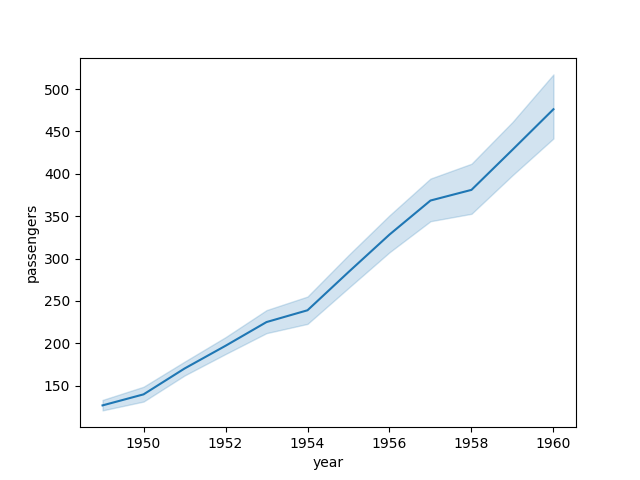
sns.lineplot(data=flights, x="year", y="passengers", errorbar="ci")
plt.show()

In the above plot, the 95% confidence interval (shaded region around the line) is plotted based on the calculated mean and statistics for each year.
This shaded confidence interval represents the the range within which the true values of parameter are likely to fall.
You can also modify the confidence interval by passing the tuple to the errorbar parameter. For example, the following plot shows the
90% confidence interval.
# import package
import seaborn as sns
import matplotlib.pyplot as plt

# line plot with 95% confidence interval
sns.lineplot(data=flights, x="year", y="passengers", errorbar=("ci", 90))
plt.show()

lineplot function calculates the confidence interval if there are multiple observations for each X-axis point. By
default, it uses the bootstrap method to generate multiple samples of the provided data and calculate the confidence
interval. The confidence interval will not be plotted if there is a single value for each point on the X-axis.2 Line plot (using fill_between)
You can also use the fill_between function from matplotlib for shading the confidence interval in Python.
We will use the flights data from seaborn to calculate and shade the confidence interval.
# import package
import seaborn as sns

# sample data
flights = sns.load_dataset("flights")
flights.head()

# output
   year month  passengers
0  1949   Jan         112
1  1949   Feb         118
2  1949   Mar         132
3  1949   Apr         129
4  1949   May         121
Calculate the 95% confidence interval using pandas groupby function,
# import package
import pandas as pd
import numpy as np
import matplotlib.pyplot as plt

# calculate upper and lower 95% confidence interval
df = flights.groupby(["year"])['passengers'].describe()[["count", "mean", "std"]].reset_index()
df["lower_ci"] = df["mean"] - 1.96*(df["std"]/np.sqrt(df["count"]))
df["upper_ci"] = df["mean"] + 1.96*(df["std"]/np.sqrt(df["count"]))

df.head()

# output
   year  count        mean        std    lower_ci    upper_ci
0  1949   12.0  126.666667  13.720147  118.903763  134.429570
1  1950   12.0  139.666667  19.070841  128.876323  150.457011
2  1951   12.0  170.166667  18.438267  159.734235  180.599098
3  1952   12.0  197.000000  22.966379  184.005548  209.994452
4  1953   12.0  225.000000  28.466887  208.893343  241.106657
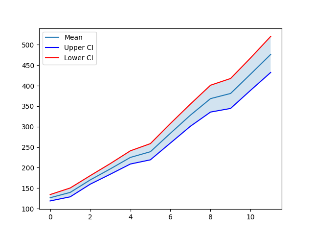
Plot and shade the 95% confidence interval,
# import package
import matplotlib.pyplot as plt

plt.plot(df["mean"], label='Mean')
plt.plot(df["lower_ci"],'-b', label='Upper CI')
plt.plot(df["upper_ci"],'-r', label='Lower CI')
plt.fill_between(df["mean"], df["lower_ci"], df["upper_ci"], )
plt.legend()
plt.show()

You can see that the 95% confidence interval is shaded using the fill_between function from the matplotlib.
3 Regression plot
In addition to the line plot, you can also plot the confidence interval for the regression plot (scatter plot with linear regression line).
# import package
import seaborn as sns
import matplotlib.pyplot as plt

# sample data
mpg = sns.load_dataset("mpg")
mpg.head()

# output
    mpg  cylinders  displacement  horsepower  weight  acceleration  model_year origin                       name
0  18.0          8         307.0       130.0    3504          12.0          70    usa  chevrolet chevelle malibu
1  15.0          8         350.0       165.0    3693          11.5          70    usa          buick skylark 320
2  18.0          8         318.0       150.0    3436          11.0          70    usa         plymouth satellite
3  16.0          8         304.0       150.0    3433          12.0          70    usa              amc rebel sst
4  17.0          8         302.0       140.0    3449          10.5          70    usa                ford torino
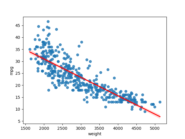
Create a scatter plot between weight and mpg variables, and add a regression line with 95% confidence interval
# import package
import seaborn as sns
import matplotlib.pyplot as plt

# create regression plot with confidence interval
sns.regplot(data=mpg, x="weight", y="mpg",ci=95, line_kws=dict(color="r"))
plt.show()

The 95% confidence interval (the shaded region around the red line) for the regression plot is calculated using the bootstrap method (the dataset is randomly resampled with a replacement for a certain number of times, and statistics are calculated from the bootstrap sampling).