Add Normal Distribution Line on Seaborn Histogram
You can use the histplot function from the seaborn library to create the histogram to see how the data is distributed.
Sometimes, we need to compare the data distribution with the theoretical normal distribution.
To overlay a normal distribution line (PDF line) on a histogram you can use the norm function from scipy.
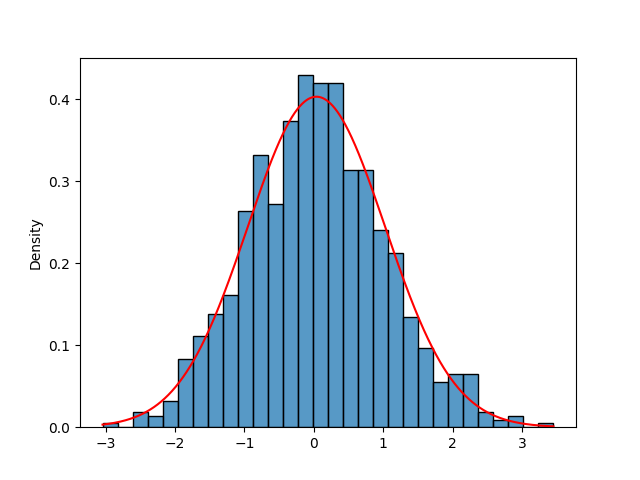
The following example explains how to create the histogram using seaborn and add a normal distribution line on the histogram plot.
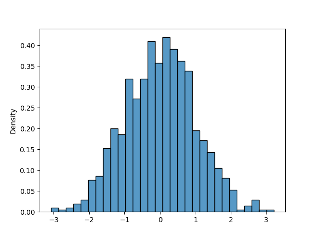
Create a histogram,
# import packages
import seaborn as sns
import numpy as np
import matplotlib.pyplot as plt

# generate random data
data = np.random.randn(1000)

# create histogram
sns.histplot(data, kde=False, stat="density", bins=30)

# show the histogram
plt.show()
In this example, we have created the 1000 random data points from a normal distribution and created the histogram using the histplot function from seaborn.
Now, to add a normal distribution line on the histogram, you can use the norm.pdf function from scipy.
# import packages
import seaborn as sns
import numpy as np
import matplotlib.pyplot as plt
from scipy.stats import norm

# generate random data
data = np.random.randn(1000)

# calculate mean and standard deviation
mean = np.mean(data)
std = np.std(data)

# create evenly spaced numbers over a specified interval
x = np.linspace(min(data), max(data), 1000)

# create histogram
sns.histplot(data, kde=False, stat="density", bins=30)

# calculate probability density function (PDF)
y = norm.pdf(x, mean, std)

# plot normal distribution line
plt.plot(x, y, color='red')

In the above plot, you can see that a normal distribution line (PDF line) is overlayed on the seaborn histogram. This helps to compare the data distribution to a theoretical normal distribution.
