Create Normal Distribution Plot From pandas DataFrame
A normal (Gaussian) distribution plot is a graphical representation of the probability density function (PDF) of a normal distribution.
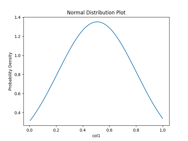
The normal distribution plot is a bell-shaped curve and it is symmetric around the mean of the data.
The normal distribution is based on two main parameters: mean and standard deviation. The mean is at the center of the distribution, whereas the standard deviation represents the spread of the distribution.
The following examples explain how to create a normal distribution plot from a pandas DataFrame.
Example 1
Generate a random pandas DataFrame with a data that follows a normal distribution
# load packages
import pandas as pd
import numpy as np

# mean of the data
mean = 0
# std dev of the data
std_dev = 1

normal_data = np.random.normal(loc=mean, scale=std_dev, size=1000)

df = pd.DataFrame(normal_data, columns=['values'])
In the above code, random.normal function from NumPy generates a random dataset with 1000 observations which has a mean of 0 and a standard deviation of 1.
In a normal distribution plot, the Y-axis represents the probability density function (PDF) which provides the probability distribution of a continuous random variable (X-axis).
Calculate the PDF using the pdf function from the SciPy,
# load packages
from scipy.stats import norm
import numpy as np

x = np.linspace(df.min(), df.max(), 500)

p  = norm.pdf(x, np.mean(df["values"]), np.std(df["values"]))
In the above code, linspace function from Numpy returns evenly spaced numbers over a specified interval (min and max values of the df). Also, we selected
500 samples from the original DataFrame (df).
We calculated the PDF using the pdf function from the SciPy for 500 samples.
Generate a normal distribution plot using matplotlib,
# load packages
import matplotlib.pyplot as plt

plt.plot(x, p)
plt.xlabel('Values')
plt.ylabel('Probability Density')
plt.title('Normal Distribution Plot')
plt.show()
The above plot is also called a standard normal distribution plot, which has a mean of 0 and a standard deviation of 1.
Example 2
Similarly, you can also create a normal distribution plot for any random pandas DataFrame
# load packages
import pandas as pd
import numpy as np
from scipy.stats import norm
import matplotlib.pyplot as plt

# generate a random pandas DataFrame
df = pd.DataFrame({'col1': np.random.rand(1000)})
mean = np.mean(df["col1"])
std_dev = np.std(df["col1"])

# create probability density function (PDF)
x = np.linspace(df.min(), df.max(), 1000)
p  = norm.pdf(x, mean, std_dev)

# visualize the normal distribution plot
plt.plot(x, p)
plt.xlabel('col1')
plt.ylabel('Probability Density')
plt.title('Normal Distribution Plot')
plt.show()
If you want to shade the regions of the normal distribution plot, please visit this article.

