Shade Areas of Normal Distribution Plot in Python
A normal (Gaussian) distribution plot is a graphical representation of the probability density function (PDF) of a normal distribution.
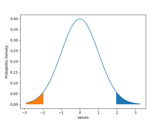
Sometimes, you need to shade the areas in a normal distribution plot or density curve to highlight the region of certain probabilities such as the 5% region on the left and right tail of the normal distribution plot.
You can use the fill_between function from matplotlib to shade the areas of the normal distribution plots or density curves.
The following examples cover different scenarios to shade the areas of the normal distribution plot using the fill_between function from matplotlib.
Shade left 5% of the area
Generate a standard normal distribution plot that has a mean of 0 and a standard deviation of 1, and shade the 5% significance region.
For 5% of the area (significance), the critical value is 1.96 for two-tailed tests.
We will use the fill_between function from matplotlib to shade the region in a normal distribution plot.
# load packages
import pandas as pd
import numpy as np
import seaborn as sns
from scipy.stats import norm
import matplotlib.pyplot as plt

# mean of the data
mean = 0
# std dev of the data
std_dev = 1

# generate pandas DataFrame with standard normal distribution
normal_data = np.random.normal(loc=mean, scale=std_dev, size=1000)
df = pd.DataFrame(normal_data, columns=['values'])
x = np.linspace(df.min(), df.max(), 1000)

# create probability density function (PDF)
p  = norm.pdf(x, mean, std_dev)

# create dataframe
df1 = pd.DataFrame({'values': x[:, 0], 'prob': p[:, 0]})

# create plot
plt.plot(df1["values"], df1["prob"])
plt.fill_between(df1["values"], df1["prob"], where=df1["values"]>1.96)
plt.fill_between(df1["values"], df1["prob"], where=df1["values"]<-1.96)
plt.xlabel('values')
plt.ylabel('Probability Density')
plt.show()

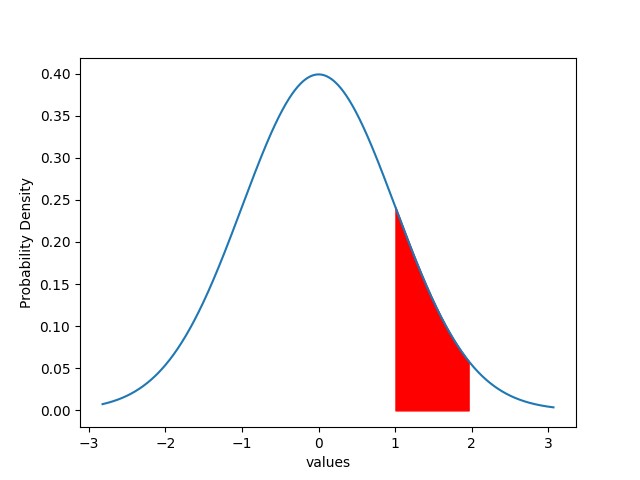
Shade custom region
In addition to the 5% significance region, you can also shade customized regions in the standard Normal distribution plot.
# load packages
import pandas as pd
import numpy as np
import seaborn as sns
from scipy.stats import norm
import matplotlib.pyplot as plt

# mean of the data
mean = 0
# std dev of the data
std_dev = 1

# generate pandas DataFrame with standard normal distribution
normal_data = np.random.normal(loc=mean, scale=std_dev, size=1000)
df = pd.DataFrame(normal_data, columns=['values'])
x = np.linspace(df.min(), df.max(), 1000)

# create probability density function (PDF)
p  = norm.pdf(x, mean, std_dev)

# create dataframe
df1 = pd.DataFrame({'values': x[:, 0], 'prob': p[:, 0]})

# create plot
plt.plot(df1["values"], df1["prob"])
plt.fill_between(df1["values"], df1["prob"], where = (df1["values"]<=1.96) & (df1["values"]>=1), color='r')
plt.xlabel('values')
plt.ylabel('Probability Density')
plt.show()

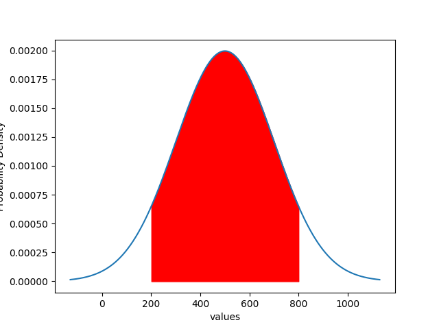
Normal distribution plot
Similarly, you can also create a normal distribution plot for any random pandas DataFrame and add the shaded region.
# load packages
import pandas as pd
import numpy as np
import seaborn as sns
from scipy.stats import norm
import matplotlib.pyplot as plt

# mean of the data
mean = 500
# std dev of the data
std_dev = 200

# generate pandas DataFrame with normal distribution
normal_data = np.random.normal(loc=mean, scale=std_dev, size=1000)
df = pd.DataFrame(normal_data, columns=['values'])
x = np.linspace(df.min(), df.max(), 1000)

# create probability density function (PDF)
p  = norm.pdf(x, mean, std_dev)

# create dataframe
df1 = pd.DataFrame({'values': x[:, 0], 'prob': p[:, 0]})

# create plot
plt.plot(df1["values"], df1["prob"])
plt.fill_between(df1["values"], df1["prob"], where = (df1["values"]<=800) & (df1["values"]>=200), color='r')
plt.xlabel('values')
plt.ylabel('Probability Density')
plt.show()
