How to Visualize Two-sample t-test in R

Two-sample t-test is a statistical test that determine if there is significant difference in the means of two independent groups.
In general, it is used to compare means between two groups to see if they are statistically different.
This article will demonstrate how to run and visualize two-sample t-tests in R.
1 Two-sample t-test in R
We will use the built-in t.test() function in the R to perform the two-sample t-test
# create sample data for two groups
drug = c(16, 15, 13, 20, 18, 18, 16, 15, 15, 17)
placebo = c(6, 5, 5, 7, 8, 9, 10, 5, 8, 7)

# perform two sample t-test
t.test(drug, placebo)

# output
	Welch Two Sample t-test

data:  drug and placebo
t = 11.02, df = 17.717, p-value = 2.337e-09
alternative hypothesis: true difference in means is not equal to 0
95 percent confidence interval:
  7.524932 11.075068
sample estimates:
mean of x mean of y
     16.3       7.0
As the p value is significant (p < 0.05), we reject the null hypothesis and suggest that the differences between drug and placebo groups are significantly different.
Now, we will use different methods to visualize the results obtained from the two-sample t-test.
2 Visualize a two-sample t-test with a barplot and error bar
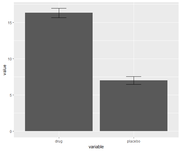
The differences in the two-sample groups can be visualized as a barplot with error bars.
The error bars are calculated as the standard error of the mean (SEM), which represents the variability in the dataset.
The length of the error bars represents the extent of the variability associated with the data.
# load package
library(ggplot2)

# create stacked data frame
df = melt(data.frame(drug, placebo))

# create barplot with error bars
ggplot(data=df, aes(x=variable, y=value)) + geom_bar(stat='summary') +
	geom_errorbar(stat='summary', width=.2)

If the differences are significant between the two groups, you can visualize it using the extent of differences in the heights of bars in the barplot.
3 Visualize a two-sample t-test with a dot plot
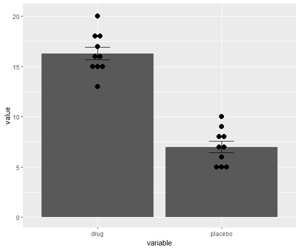
The differences in the two-sample groups can be visualized as a dot plot. The dot plot is useful to visualize the distribution of data points in the dataset.
Each dot on the graph represents individual data points and helps to understand the data distributions and patterns, making it a valuable tool for hypothesis testing using t-test.
# load package
library(ggplot2)

# create stacked data frame
df = melt(data.frame(drug, placebo))

# create dot plot
ggplot(data=df, aes(x=variable, y=value)) + geom_bar(stat='summary') +
	geom_dotplot(binaxis='y', stackdir='center') +
	geom_errorbar(stat='summary', width=.2)

If the differences are significant between the two groups, you can visualize it using the distributions and patterns on the dot plot.
4 Visualize a two-sample t-test with boxplot
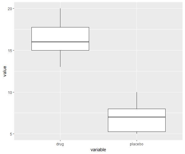
The differences in the two-sample groups can be visualized as a boxplot.
Boxplot are more useful than barplot, and provides more information such as shape, spread, and central tendency about the data.
Boxplot are also useful to identify if there is any outlier in the dataset.
# load package
library(ggplot2)

# create stacked data frame
df = melt(data.frame(drug, placebo))

# create boxplot
ggplot(data=df, aes(x=variable, y=value)) + geom_boxplot()
If the differences are significant between the two groups, you can visualize the differences in the spread and central tendency of the two groups using the boxplot.
