Visualize DBSCAN Clusters in R
DBSCAN (Density-Based Spatial Clustering of Applications with Noise) is an unsupervised clustering algorithm that groups data points that are close to each other in a high-density region and separates data points from low-density regions (noisy points).
Visualizing the results of the DBSCAN cluster is essential to understanding the structure and patterns of your data, and the effectiveness of DBSCAN.
This article focuses on various methods for visualizing the DBSCAN results in R using dbscan and ggpairs functions.
1 Get sample dataset
We will use the iris dataset for DBSCAN analysis
# load the iris dataset
data(iris)

# view first few rows
head(iris, 2)

  Sepal.Length Sepal.Width Petal.Length Petal.Width Species
1          5.1         3.5          1.4         0.2  setosa
2          4.9         3.0          1.4         0.2  setosa

# keep first four features as we do not need target (species) feature
iris_data = iris[, -5]
head(iris_data, 2)

  Sepal.Length Sepal.Width Petal.Length Petal.Width
1          5.1         3.5          1.4         0.2
2          4.9         3.0          1.4         0.2
2 Perform DBSCAN in R
In R, you can perform the DBSCAN using dbscan() function from dbscan package.
The dbscan() function requires eps and minPts parameters to calculate DBSCAN clusters. You can read this article if
you’re unsure how to calculate these parameters.
# import package
# install.packages("dbscan")
library(dbscan)

# perform DBSCAN
dbscan(iris_data, eps = 0.4, minPts = 4)
# output
DBSCAN clustering for 150 objects.
Parameters: eps = 0.4, minPts = 4
Using euclidean distances and borderpoints = TRUE
The clustering contains 4 cluster(s) and 25 noise points.

 0  1  2  3  4
25 47 38 36  4

Available fields: cluster, eps, minPts, dist, borderPoints

# -1 value represents noisy points could not assigned to any cluster
DBSCAN output indicates four clusters (1, 2, 3 and 4). With 47 data points, cluster 1 is the largest, and with 4 points, cluster 4 is the smallest.
Cluster 0 represents the noise points that could not be assigned to any cluster.
3 Visualize DBSCAN clusters
The visualization of the DBSCAN clusters is necessary to understand the structure of your data.
If you have a two-dimensional dataset, you can simply create the scatter plot. When you have a high-dimensional dataset, you need to use either a pair plot or dimensionality reduction techniques before visualization.
3.1 Pair plot
As there are four features (sepal length, sepal width, petal length, and petal width), we will use the pairwise plot among those variables to see the clusters.
Here, we will use the ggpairs() function from the GGally package to visualize the pairwise scatter plot among
the four features.
# load package
# install.packages("GGally")
library(GGally)

# pair plot for clusters
clus <- dbscan(iris_data, eps = 0.4, minPts = 4)
ggpairs(iris_data, aes(color=as.factor(clus$cluster)))
The pairwise scatter plot displays the individual clusters with different color for each pair of features.
3.2 Dimensionality reduction plot
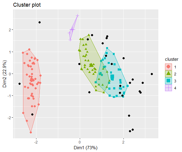
As there are four features, it is hard to visualize them in one plot. In this case, we can use dimensionality reduction methods such as PCA to view the scatter plot in two dimensions (reduce 4-dimensional data into 2 dimensions).
We will use the fpc and factoextra packages to visualize the DBSCAN clusters in 2-dimensional space.
# install.packages("factoextra")
# install.packages("fpc")
library(factoextra)
library(fpc)

# perform DBSCAN with fpc package
clus <- fpc::dbscan(iris_data, eps = 0.4, MinPts = 4)

# visualize the clusters in 2-dimensional space
fviz_cluster(clus, iris_data, geom = "point", pointsize = 2)

The above 2-dimensional plot of 4 features visualizes the well-separated DBSCAN clusters.
