Plot Confidence Interval with ggplot2
A confidence interval provides an estimated range of interval which is likely to include the unknown parameter (such as mean) of a population when you draw samples many times from the population.
In R, you can use the ggplot function from the ggplot2 library to plot the confidence interval.
The following examples explain plotting confidence Intervals using the ggplot2 library.
Plot 95% confidence interval
Let’s use an example of built-in mtcars data for plotting a 95% confidence interval,
data('mtcars')

# view data frame
head(mtcars)
                  mpg cyl disp  hp drat    wt  qsec vs am gear carb
Mazda RX4         21.0   6  160 110 3.90 2.620 16.46  0  1    4    4
Mazda RX4 Wag     21.0   6  160 110 3.90 2.875 17.02  0  1    4    4
Datsun 710        22.8   4  108  93 3.85 2.320 18.61  1  1    4    1
Hornet 4 Drive    21.4   6  258 110 3.08 3.215 19.44  1  0    3    1
Hornet Sportabout 18.7   8  360 175 3.15 3.440 17.02  0  0    3    2
Valiant           18.1   6  225 105 2.76 3.460 20.22  1  0    3    1
Calculate the mean values, and upper and lower limits for 95% confidence interval for groups in cyl variable using the dplyr package
# load packages
library(dplyr)
library(gmodels)

results <- mtcars %>%
  group_by(cyl) %>%
  summarise(
    mean_mpg = mean(mpg),
    ci_lower = ci(mpg)[2],
    ci_upper = ci(mpg)[3])


results

# A tibble: 3 × 4
    cyl mean_mpg ci_lower ci_upper
  <dbl>    <dbl>    <dbl>    <dbl>
1     4     26.7     23.6     29.7
2     6     19.7     18.4     21.1
3     8     15.1     13.6     16.6
We have used the ci function from the gmodels library to calculate the 95% confidence interval. By default, the ci function calculates a 95% confidence interval.
Plot the 95% confidence interval using the ggplot2
# load packages
# install.packages("ggplot2")
library(ggplot2)

ggplot(results, aes(x=cyl, y=mean_mpg)) +
  geom_line(color="blue") +
  geom_ribbon(aes(ymin=ci_lower, ymax=ci_upper), fill="blue", alpha=0.2)
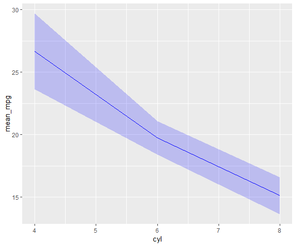
In the above code, we used the results dataframe to plot the line graph with a calculated 95% confidence interval. The geom_line function plots the line and the geom_ribbon function shades a area around a line
to represent the confidence interval.

Plot 90% confidence interval
Let’s use an example of built-in mtcars data for plotting 90% confidence interval,
data('mtcars')

# view data frame
head(mtcars)
                  mpg cyl disp  hp drat    wt  qsec vs am gear carb
Mazda RX4         21.0   6  160 110 3.90 2.620 16.46  0  1    4    4
Mazda RX4 Wag     21.0   6  160 110 3.90 2.875 17.02  0  1    4    4
Datsun 710        22.8   4  108  93 3.85 2.320 18.61  1  1    4    1
Hornet 4 Drive    21.4   6  258 110 3.08 3.215 19.44  1  0    3    1
Hornet Sportabout 18.7   8  360 175 3.15 3.440 17.02  0  0    3    2
Valiant           18.1   6  225 105 2.76 3.460 20.22  1  0    3    1
Calculate the mean values, and upper and lower limits for 90% confidence interval for groups in cyl variable using the dplyr package
# load packages
library(dplyr)
library(gmodels)

results <- mtcars %>%
  group_by(cyl) %>%
  summarise(
    mean_mpg = mean(mpg),
    ci_lower = ci(mpg, confidence=0.90)[2],
    ci_upper = ci(mpg, confidence=0.90)[3])


results

# A tibble: 3 × 4
    cyl mean_mpg ci_lower ci_upper
  <dbl>    <dbl>    <dbl>    <dbl>
1     4     26.7     24.2     29.1
2     6     19.7     18.7     20.8
3     8     15.1     13.9     16.3
We have used the ci function from the gmodels library to calculate the 90% confidence interval.
Plot the 90% confidence interval using the ggplot2
# load packages
# install.packages("ggplot2")
library(ggplot2)

ggplot(results, aes(x=cyl, y=mean_mpg)) +
  geom_line(color="blue") +
  geom_ribbon(aes(ymin=ci_lower, ymax=ci_upper), fill="blue", alpha=0.2)
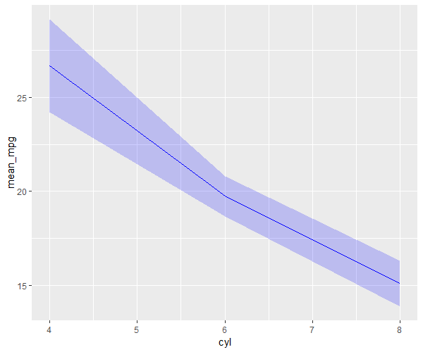
In the above code, we used the results dataframe to plot the line graph with calculated 95% confidence interval. The geom_line function plots the line and the geom_ribbon function shades area around a line
to represent the confidence interval.
