Fill Area Under a Curve in a Seaborn Distribution Plot
In Python, you can use the kdeplot function from seaborn to plot the distribution curve using kernel density estimation (KDE).
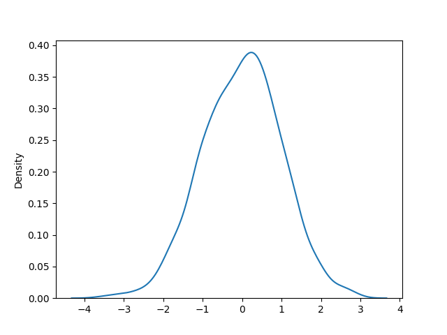
The generated distribution plot (also called as KDE plot) is similar to a histogram plot but it has smooth line instead of discrete bins.
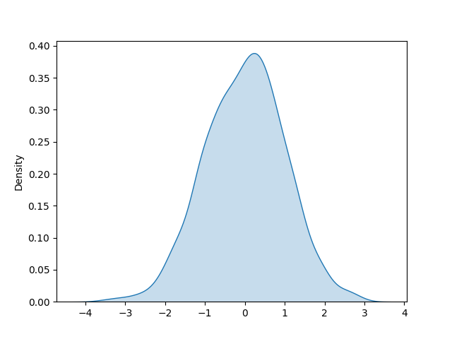
Sometimes, you might want to fill the area under the KDE curve to highlight and compare the distribution more effectively.
You can use the fill parameter to fill the area under curver in the distribution plot generated from the kdeplot function in seaborn.,
The following example explains how to create the distribution plot and fill the area under the curve using seaborn.
Single curve
Create a distribution plot,
# import packages
import seaborn as sns
import numpy as np
import matplotlib.pyplot as plt

# generate random data
data = np.random.randn(1000)

# create distribution plot
sns.kdeplot(data)

# show the histogram
plt.show()
In this example, we have created the 1000 random data points from a normal distribution and created the distribution plot using the kdeplot function from seaborn.

Now, you can use the fill parameter with the kdeplot function to fill the area under curve in the distribution plot.
# create distribution plot and fill area under curve
sns.kdeplot(data, fill=True)

Filling the area under the curve is particularly useful for comparing the distributions, highlighting specific regions, and creating visually engaging plots.
You can customize the style, color, and transparency of the KDE plot using various parameters as shown here.
Multiple curves
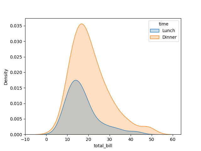
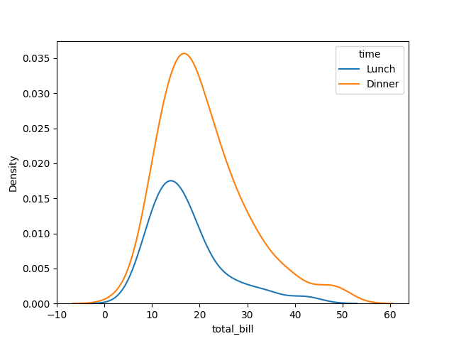
You can also plot multiple distribution plots and fill the area under curves using the kdeplot function in seaborn.
We will use the tips dataset from the Seaborn package to plot the multiple distribution plots.
# import packages
import seaborn as sns
import matplotlib.pyplot as plt

# load tips dataset
tips = sns.load_dataset("tips")

# view dataset
tips.head()

   total_bill   tip     sex smoker  day    time  size
0       16.99  1.01  Female     No  Sun  Dinner     2
1       10.34  1.66    Male     No  Sun  Dinner     3
2       21.01  3.50    Male     No  Sun  Dinner     3
3       23.68  3.31    Male     No  Sun  Dinner     2
4       24.59  3.61  Female     No  Sun  Dinner     4

# create distributions plots based on total_bill and time variables
sns.kdeplot(data=tips, x="total_bill", hue="time")

# show the histogram
plt.show()
Fill the area under the curves,
# create distributions plots based on total_bill and time variables
sns.kdeplot(data=tips, x="total_bill", hue="time", fill=True)

# show the histogram
plt.show()

Filling the area under the curves is particularly useful for comparing multiple distributions, highlighting specific regions, and creating visually engaging plots.
