Shade Confidence Intervals with Specific Values in R
The shading of confidence intervals on a line plot is useful to understand the range within which the true unknown parameter value lies with a certain level of confidence (e.g. 95% confidence interval).
In R, you can various functions such as ggplot2 and polygon to shade the confidence intervals with specific values given in the table.
The following example explains how to shade the confidence intervals using ggplot2 and polygon functions in R.
Using ggplot2
Let’s create a table with mean values and 95% confidence intervals using the built-in mtcars data,
data('mtcars')

# view data frame
head(mtcars)
                  mpg cyl disp  hp drat    wt  qsec vs am gear carb
Mazda RX4         21.0   6  160 110 3.90 2.620 16.46  0  1    4    4
Mazda RX4 Wag     21.0   6  160 110 3.90 2.875 17.02  0  1    4    4
Datsun 710        22.8   4  108  93 3.85 2.320 18.61  1  1    4    1
Hornet 4 Drive    21.4   6  258 110 3.08 3.215 19.44  1  0    3    1
Hornet Sportabout 18.7   8  360 175 3.15 3.440 17.02  0  0    3    2
Valiant           18.1   6  225 105 2.76 3.460 20.22  1  0    3    1
Calculate the mean values and 95% confidence interval for groups in cyl variable using the dplyr package
# load packages
library(dplyr)
library(gmodels)

results <- mtcars %>%
  group_by(cyl) %>%
  summarise(
    mean_mpg = mean(mpg),
    ci_lower = ci(mpg)[2],
    ci_upper = ci(mpg)[3])


results

# A tibble: 3 × 4
    cyl mean_mpg ci_lower ci_upper
  <dbl>    <dbl>    <dbl>    <dbl>
1     4     26.7     23.6     29.7
2     6     19.7     18.4     21.1
3     8     15.1     13.6     16.6
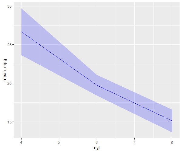
Plot and shade the 95% confidence interval using the ggplot2
# load packages
# install.packages("ggplot2")
library(ggplot2)

ggplot(results, aes(x=cyl, y=mean_mpg)) +
  geom_line(color="blue") +
  geom_ribbon(aes(ymin=ci_lower, ymax=ci_upper), fill="blue", alpha=0.2)

In the above plot, the 95% confidence interval is shaded around the mean line providing a visual representation of uncertainty.
Using polygon
You can also use the polygon function to shade the confidence intervals.
Let’s create a table with mean values and 95% confidence intervals using the built-in mtcars data,
data('mtcars')

# view data frame
head(mtcars)
                  mpg cyl disp  hp drat    wt  qsec vs am gear carb
Mazda RX4         21.0   6  160 110 3.90 2.620 16.46  0  1    4    4
Mazda RX4 Wag     21.0   6  160 110 3.90 2.875 17.02  0  1    4    4
Datsun 710        22.8   4  108  93 3.85 2.320 18.61  1  1    4    1
Hornet 4 Drive    21.4   6  258 110 3.08 3.215 19.44  1  0    3    1
Hornet Sportabout 18.7   8  360 175 3.15 3.440 17.02  0  0    3    2
Valiant           18.1   6  225 105 2.76 3.460 20.22  1  0    3    1
Calculate the mean values and 95% confidence interval for groups in cyl variable using the dplyr package
# load packages
library(dplyr)
library(gmodels)

results <- mtcars %>%
  group_by(cyl) %>%
  summarise(
    mean_mpg = mean(mpg),
    ci_lower = ci(mpg)[2],
    ci_upper = ci(mpg)[3])


results

# A tibble: 3 × 4
    cyl mean_mpg ci_lower ci_upper
  <dbl>    <dbl>    <dbl>    <dbl>
1     4     26.7     23.6     29.7
2     6     19.7     18.4     21.1
3     8     15.1     13.6     16.6
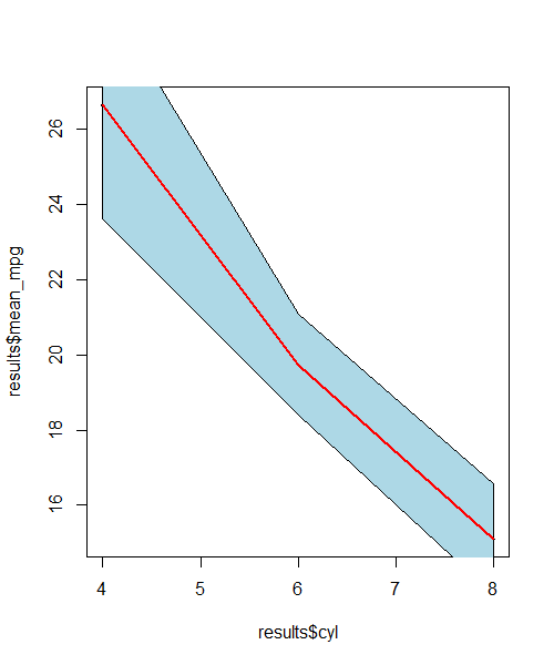
Plot and shade the 95% confidence interval using the polygon
# shade confidence interval region
polygon(c(results$cyl, rev(results$cyl)), c(results$ci_upper, rev(results$ci_lower)), col = "lightblue")
# add line
lines(results$cyl, results$mean_mpg, col="red", lwd=2)

In the above plot, the 95% confidence interval is shaded around the mean line providing a visual representation of uncertainty.