Plot 95% Confidence Interval as Errobar in Python
The 95% confidence interval represents the range of values which are likely to contain true population parameter such as population mean with a 95% confidence level.
Typically, the 95% confidence interval for a large sample is calculated as:
Where, x̄ is a sample mean, σ is the population standard deviation, n is the sample size, and 1.96 is a critical value for 95% confidence.
The part of the equation in bracket is also called as standard error of the mean.
You can use this formula to calculate the 95% confidence interval for the data and plot them as errorbar using the matplotlib.
The following example explains in detail how to plot a 95% confidence interval as errorbar in Python.
Create a sample dataset
Create a random pandas DataFrame,
# import package
import pandas as pd

# Create the contingency table
df = pd.DataFrame({'group': ['A', 'A', 'A', 'B', 'B', 'B', 'C', 'C', 'C'] ,
                   'value': [10, 12, 13, 15, 16, 20, 5, 6, 5] })

# view df
df.head(5)

  group  value
0     A     10
1     A     12
2     A     13
3     B     15
4     B     16
Calculate 95% confidence interval
Calculate the 95% confidence interval for each group in the DataFrame.
# import package
import pandas as pd

# calculate mean and standard error
group_mean = df.groupby('group')['value'].mean()
group_sem = df.groupby('group')['value'].sem()

# calculate 95% confidence interval range
ci = 1.96 * group_sem

print(ci)

# output
group
A    1.728558
B    2.993949
C    0.653333
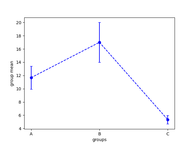
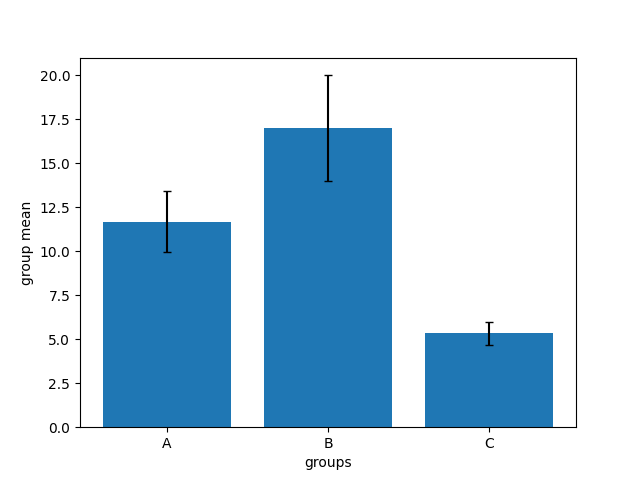
We will use calculated 95% confidence intervals for plotting errorbar on a line and bar chart.
Plot 95% confidence interval
Now, you can use the errorbar function from matplotlib to plot the 95% confidence intervals as errorbar
for each group.
# import package
import matplotlib.pyplot as plt

plt.errorbar(x=group_mean.index, y=group_mean, yerr=ci, capsize=3,
	fmt='b--o')
plt.xlabel('groups')
plt.ylabel('group mean')

In addition to line plot, you can also create bar chart and add 95% confidence interval as errorbar.
# import package
import matplotlib.pyplot as plt

plt.bar(x=group_mean.index, height=group_mean, yerr=ci, capsize=3)
plt.xlabel('groups')
plt.ylabel('group mean')
